Visualizations have immense value. They can engage users, help users answer key questions, and also help identify issues or opportunities. But visualizations can also cause issues. Visualization mistakes exist and can be costly.
Mistakes make users work harder or increase the chance of poor decisions. Below are 3 mistakes that should, and can be avoided.
01 - Visualization Mistakes - Being Disorganized
Visualizations should make life easy for viewers. Any visualization that is disorganized takes extra time and effort.
In the following example Users are keen to understand which T-Shirts are selling and how many. Here it is:
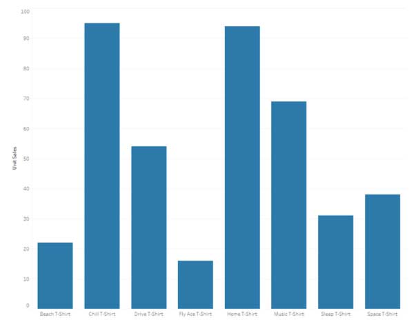
Easy. The users can see that Chill and Home T-Shirts are at the top and who number 3, 4, and 5 are. But is it really easy?
The lack of organization in the visualization makes users work. The list is alphabetical, not sorted.
Here is a second attempt:
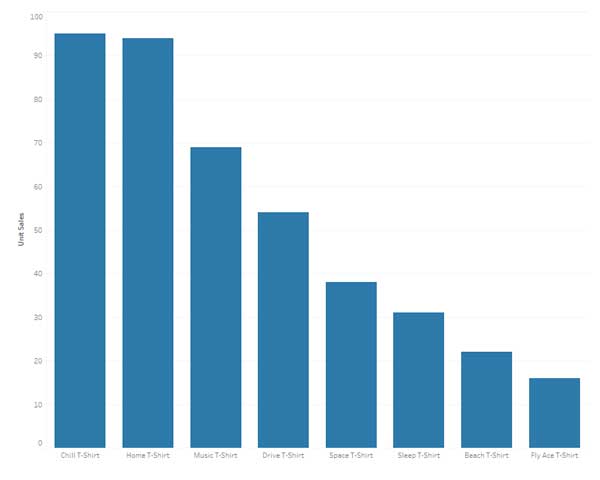
Better. The sort makes it easy to see top sellers. However, there are still 2 issues:
- Any Graph that slopes down left to right is typically 'bad' so this visualization is inadvertently setting a negative tone.
- If the Execs wanted to know how many Space T-Shirts were sold they could guess... about 36?
Here is a third attempt:
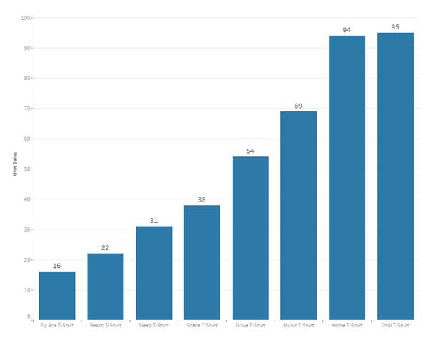
Anyone viewing this visualization will immediately know the high and low sellers and how many were sold. The visualization requires minimal effort.
02 - Visualization Mistakes - No Consistency
It's not unusual in a report, dashboard, or similar for there to be multiple visualizations. For instance, the following mini dashboard might be used to review top T-Shirt styles by size:
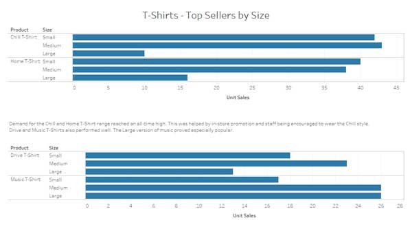
At first glance, this might seem fine, or perhaps it doesn't feel right. There are two obvious consistency issues here:
- The titles don't line up. This inconsistency looks messy and for many users will also erode trust.
- The scales are inconsistent. This is a big one. A casual glance makes it difficult to see the relative size between the two graphs. It could also lead to incorrect assumptions like Music T-Shirts having similar sales to Chill and Home.
Here is a second attempt with those two issues removed:
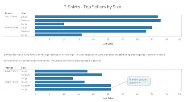
This approach uses a consistent axis and consistent sizing. It looks neater and removes the risk of users inadvertently making incorrect assumptions.
03 - Visualization Mistakes - Abusing Pies and Donuts
Pie and Donut charts create a lot of debate. Some people love them, others hate them. In my view, they have their place. Changing visuals occasionally will increase interest and they also rapidly convey key information. They can also be abused or used incorrectly.
Here is an example Donut:
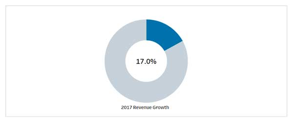
It clearly shows 17%. But 17% of what? A pie or donut style visualization is geared toward showing the percentage of a whole. The above example shows 17% year-on-year growth in Revenue. It does not make sense. Revenue was not 17% of the total.
If the donut was showing say, a share of revenue generated from Canada then it would make more sense.
A better way to show this year-on-year growth is to use a more suitable format. Here is an example:
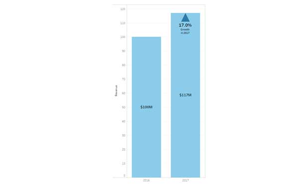
This approach clearly shows the 17% growth and puts it in context. Keeping visualizations in context and helping users avoid incorrect assumptions helps create value.
With any visualization, especially those going to a large user base, it's important to test and get feedback. As a general rule simplicity beats complexity.
If you avoid visualization mistakes then expect more questions and more requests from users. They will want to know and understand more. That's a great outcome and opens the door to interactive visualizations and more advanced functionality.
