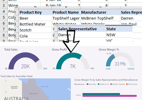
Power BI is the suite of business analytics tools developed by Microsoft to help businesses systematically organise and analyse data, and share insights. Power BI provides cloud-based BI services, known as "Power BI Services", along with "Power BI Desktop", a desktop based interface as the name implies.
Power BI works with many data sources but is primarily designed to work with SQL Server and Azure Analysis Services to transform complex data into business insights.
Using Power BI to turn Data into Dashboards
Power BI makes the claim that you can:
"Go from data to insight in minutes"
So I put it to the test... In this post I take some fairly simple data on product sales and see just how easy it is to publish something useful on the web. The conclusion... for someone with reasonable skills, it's possible. Of course... this assumes no data issues 😉
Simple Visualisation Mistakes to Avoid.
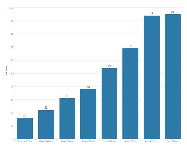
Power BI enables the use of sophisticated visualisations through reports and dashboards. However, any time that visualisations are used it's important to make it easy for users and increases the likelihood of user interpretation being accurate.
This post explores 3 simple mistakes that can easily be avoided when creating dashboards.
Next Steps...
To see tips on Data Strategy, Analytics and other useful data tools such as SQL Server and Excel VBA please visit the Data Insight blog.

