Microsoft promotes Power BI as the tool that lets users go from data to insights in minutes. This, of course, assumes some Power BI skills and in this post, I put the hype to the test.
Using an excel workbook with several sheets of related product sales data my goal is to turn this into a useful dashboard (or in the case a report I can publish on the web and embed in this post). It's important to note that in many commercial settings data models may already exist, but don't be fooled... even with good data models, it's often a challenge to get the exact data in the exact format you need.
Anyway...
For this example, I've kept the data relatively simple. From a business perspective, I assume several summary files of relevant data that I need to get in front of the Executive. Ideally showing them some nice interactive visuals and sparing them from tables of numbers (and of course, impressing them with my Power BI Skills).
I've embedded the simple multi-page report at the bottom of this post.
The Business Background:
For some perspective, this case study is based on an Australian Drinks distributor that sources alcoholic and non-alcoholic drinks from a range of manufacturers. It sells these in the Eastern States of Australia. Sales Reps are state-based and represent one or more manufacturers. There are 3 years of data. Note: The business and any reference to other businesses are purely figments of my imagination.
The Source Data:
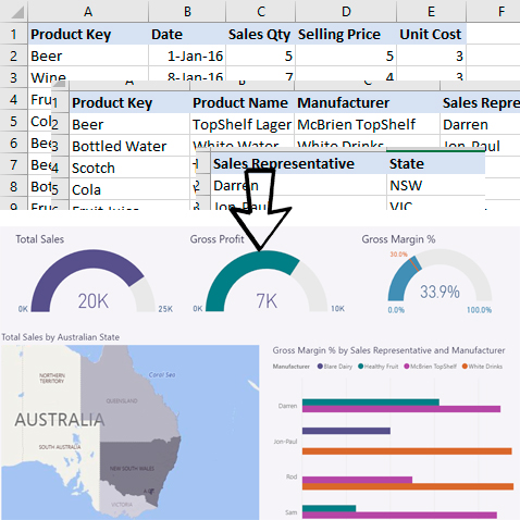
I use three files: Sales, Product, and Sales Rep that I've saved as 3 sheets of an Excel Workbook. Some sample records from each of these are shown below. The sales data extends over 3 years and includes hundreds of summary records.

With the data organized into a single Excel workbook, it's a simple case of opening up Power BI Desktop and selecting 'Get Data'. There are many connectors and in this case, it's simple to use the Excel connector, select the workbook, and 'load' the 3 sheets.
At this stage... all the data is now within Power BI. In theory, I can now build one or more reports, publish to Power BI online, create a dashboard and share it with the world.
Unfortunately, it's not quite that easy. Even with my relatively simple data, I need to check it, define some relationships, and enhance it.
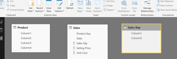
To get a sense of what my data looks like I can click on the Relationships Tab and see how Power BI is representing it...

HHmmm not great. For the two of the sheets/tables titles are missing, there are no links between the tables, and on reflection, I really need to know Total Sales, Total Cost, and some Margins.
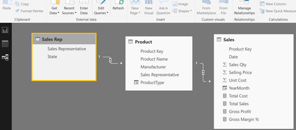
These next steps require some core Power BI skills. In simple terms, I ensure the first row of data becomes headers, check the data type of each field, add some measures and a couple of extra columns (actually I added the columns later to enable the trend visualization by Product Type... ). Finally, I defined the relationships between the tables.
Here is an example of one of the measures:
Total Sales = SUMX(Sales,Sales[Sales Qty]*Sales[Selling Price])
SUMX is a DAX (Data Analysis Expressions) Function the formula language of Power BI.
Anyone who understands relational databases and has played with data a bit will be able to work out these steps fairly easily. This is what the Relationship Tab now looks like:

Now the data is imported, transformed, and enhanced the process of building reports can start. In Power BI Desktop that means building one or more reports and then publishing to Power BI Online. Within Power BI Online we can then take one or more visuals from the reports and create one or more tailored dashboards. (Note: I've embedded a report below as dashboards can't be shared on the web).
Creating basic visuals is easy. Creating really meaningful visuals that follow good design, tell a story, have effective drill-through and filtering is more challenging. Check out my post on avoiding visualisation mistakes for some initial pointers.
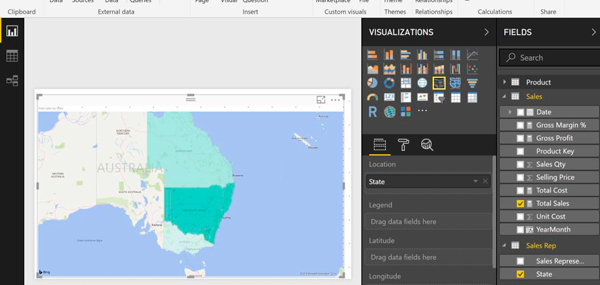
Having the right level of Power BI skills will mean that you can create some pretty impressive visuals and reports, fairly quickly. As a quick example within the report tab I created the following visual with just 3 mouse clicks:
First I selected the filled map visualization option and then I selected Total Sales followed by State. Quick and Easy...

This post is not intended to walk through all the steps in creating reports. Needless to say, much time can be spent creating good-looking visuals. Power BI Skills focused on visual and report creation becomes very important.
To give a quick demonstration of the kind of things that are possible below is the multi-page report generated from the source data. Much easier to use than long tables of data.
