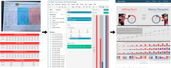
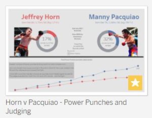
 Many people react differently to data depending on how it is presented. To demonstrate I've taken the referee scores and some punch stats from the July 2017 Horn v Pacquiao Boxing fight and turned them into a Tableau Viz.
Here are the two tables of data generated from the fight. The Referee Score Cards and the Punchstat Data from Compubox.
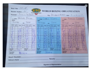
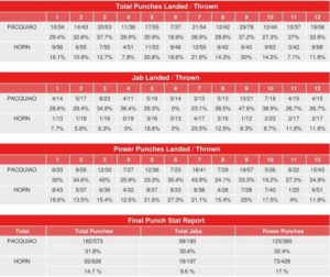
These two tables of numbers aren't very user-friendly. It's difficult to rapidly understand what they are saying (and with the referee cards... very difficult).
I took this raw data (or the pieces I needed) and got them into Excel. I used as few columns as possible, nothing fancy. Here's a snapshot of what I mean:
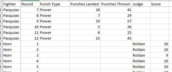
Not beautiful, but certainly easy to work with, in Tableau.
Within Tableau, I mimicked some elements from another Viz showing the Mayweather McGregor fight. I changed it up by only using power punches and by adding the referee scores, a much bigger area of debate in this fight. I also used a bit of Photoshop so apologies to any Photoshop users out there.
Tableau Viz - Horn v Pacquiao
See the embedded version below or visit this link.
This Tableau Viz is designed for larger screens. Double click on the data points to see some of the underlying data.
The resulting Viz, in my view, is certainly more appealing than raw data and much easier to derive information from.
This simple demonstration clearly shows the power of taking raw data and showing it in a form that is more interesting. Newspapers and online sites do it every day.
With respect to the fight. Horn threw more punches but connected with a lot less. The judges had him winning many of the early rounds. Pacquiao looked to have been conserving energy and be more measured. When Pacquiao unleashed in the 8th and 9th he certainly turned the momentum. At that stage Horn looked done for... but he rallied. He connected with more power punches in the 10th and the judges had him winning the final two rounds.
