Surveys... simple yet capable of unlocking amazing insight. Visualizing survey data using a tool like Tableau and making those visualizations interactive and individual is powerful.
But don't take my word for it.
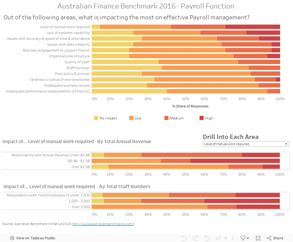
Below is a live, interactive example I created with thanks to the Australian Finance Benchmark. Have a quick play. The payroll function may not be the most exciting topic, but it beats getting a PDF.
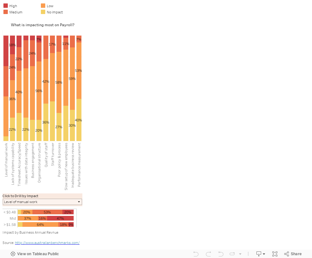
This example just shows a single question. Importantly you can select and drill down on any of the areas impacting payroll to discover more detail based on the annual revenue size of respondents (and total staff if you're viewing on a large screen).
For instance, 'manual work' is clearly seen as the biggest impact overall. But drill down on this and also on 'lack of system capability and it's the latter that's more important for businesses with revenues over $1.5B.
The possibilities of this approach when coupled with a larger survey become endless. It also means increasing the potential to discover insights or new business questions.
Learn More About Visualizing Survey Data
Several key themes emerge when visualizing and presenting survey data:
- Providing an interactive and flexible user experience that allows personalization is very powerful. Most senior users want summary information with the option to drill down;
- Reviewing survey results is far more interesting for everyone and much more likely to uncover insights when using an interactive tool as opposed to paging through hard-copy reports. It also means users can easily compare their answers or their businesses position relative to other responses, something that seems very popular; and
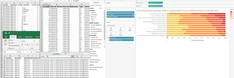
- Transforming and preparing your survey data for maximum benefits and ease of use in visualizations is critical. I've found that Using Excel VBA to transform data files from existing survey data can rapidly speed this process;
In addition, there is a range of great resources available. A survey-focused whitepaper by Tableau and the fantastic array of resources listed by datarelevations are two great examples.
Nice work. Noticed it’s a different viz on mobile versus desktop? How did you do that?
Hi Renee, thanks for visiting. Good pickup. There are actually 2 different visualizations based on the same data. The Viz for the desktop doesn’t really work on mobile… so i created a second one that worked a little better. Depending on screen size the one or the other displays. Tim
I agree about for getting insights we need to visualize survey results properly. I often use VizualSurvey to clean my survey data and visualize using their templates. I know many audience of your website loves to visualize survey results but don’t have the time or expertise to do it accurately. I think this article aboutvisualizing survey data will help them